
Dashboard
The Dashboard is Orbit's home screen — a grid of cards, called widgets, each showing one part of Orbit at a glance. You decide which widgets are on it and how much room each one gets. The arrangement is yours alone; changing it here changes nothing for anyone else.
Opening the page
- Sign in — the Dashboard is the screen Orbit opens on.
- To come back to it from anywhere, use the house icon near the top of the left rail.
The page header reads Home, and the dashboard you are looking at is named beside it. That name is the first thing to learn, because everything else on this page belongs to whichever dashboard is showing.
The page at a glance
The grid is three columns wide. A widget takes one, two or three columns and as many rows as it needs, and it snaps to the grid when you move it — so the dashboard always looks tidy even though you arranged it yourself.
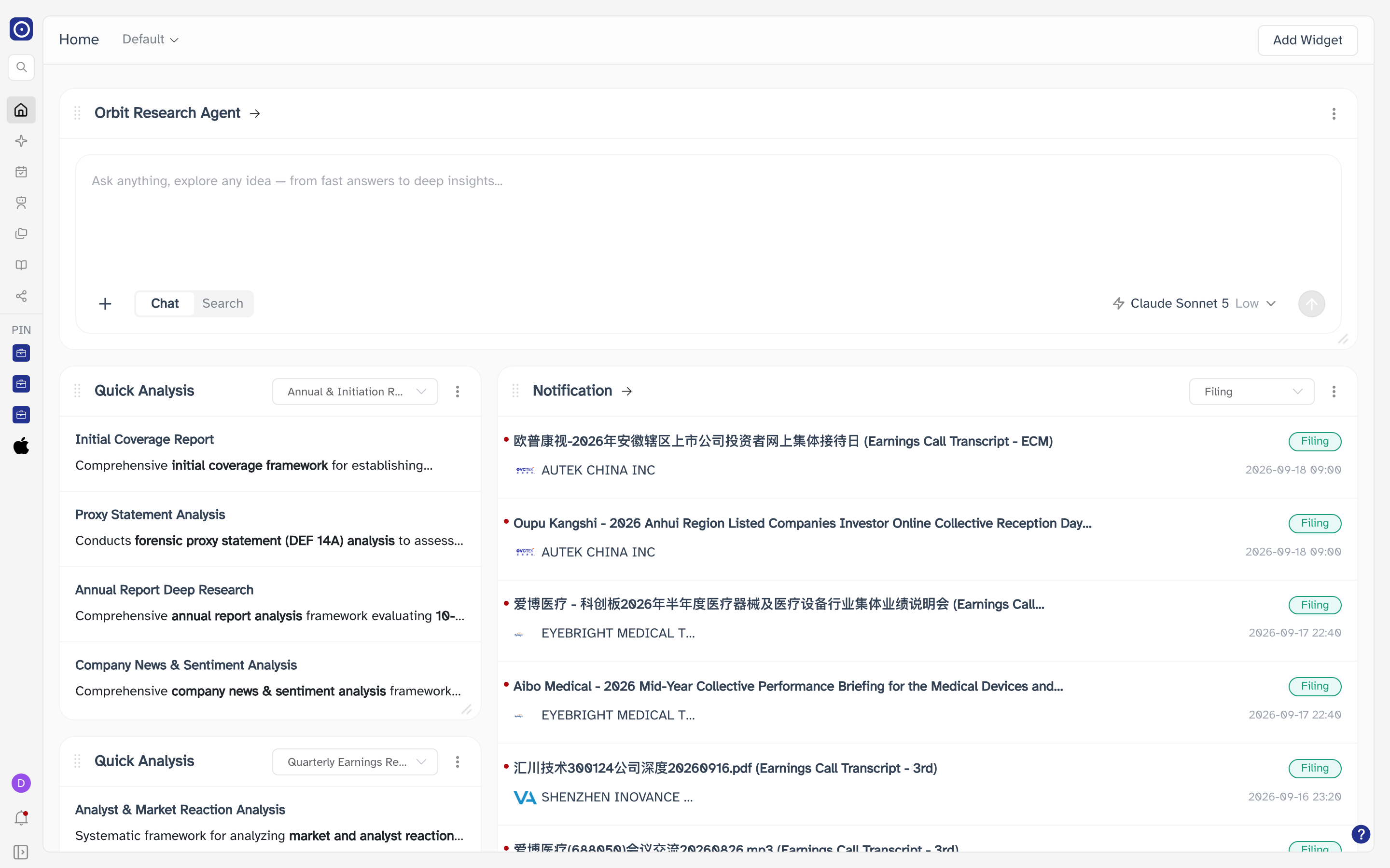
| On every widget | What it does |
|---|---|
| Handle | The grip at the left of the widget's title. Drag it to move the widget around the grid. |
| Title | The widget's name. A title with an arrow after it opens the full page that widget summarises — see What a widget can be. |
| ⋮ | Opens the widget's menu. It holds Delete and nothing else. |
| Bottom-right corner | Drag the corner to change how wide and tall the widget is. |
Switching dashboards
You can keep more than one dashboard — one for the portfolios you run, another for a sector you are watching, and so on. The name beside Home is where you switch between them.
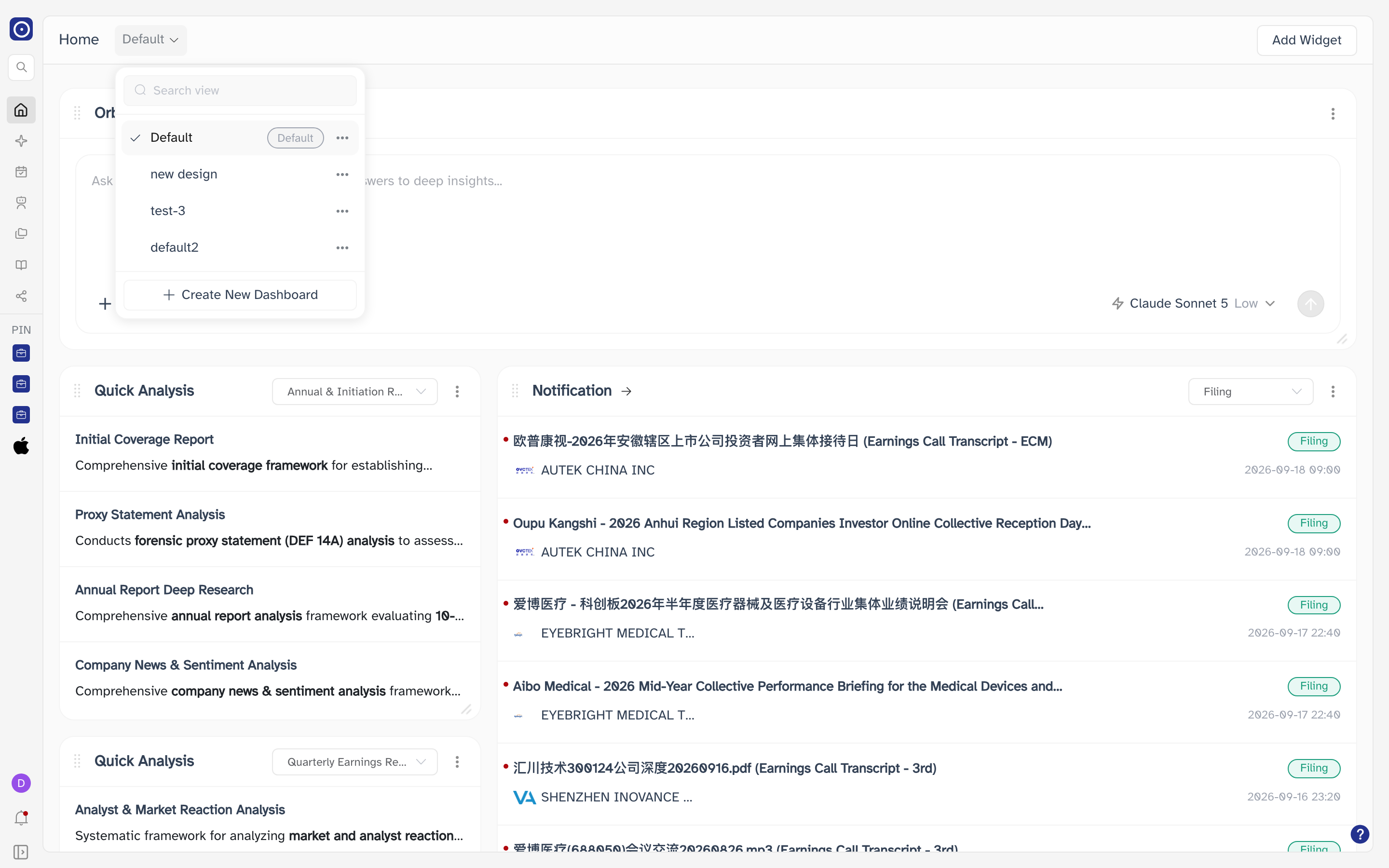
| Control | What it does |
|---|---|
| Search view | Filters the list as you type. If nothing matches, the list reads No views found. |
| A dashboard's name | Switches to it straight away. |
| Set as default | Makes that dashboard the one Orbit opens when you sign in. Only one can hold the badge. |
| Rename | Opens a small dialog with a single Name field and Cancel / Submit. |
| Delete | Removes the dashboard and the widgets on it, after a confirmation. |
| Create New Dashboard | Opens the New Dashboard dialog below. |
Creating a dashboard
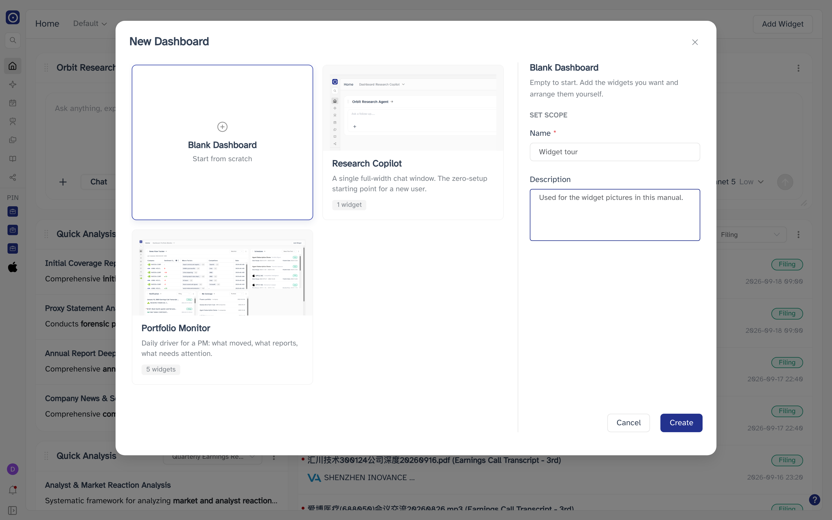
Create New Dashboard offers a blank grid or one of Orbit's ready-made layouts. Whichever you pick, you name it before it is created.
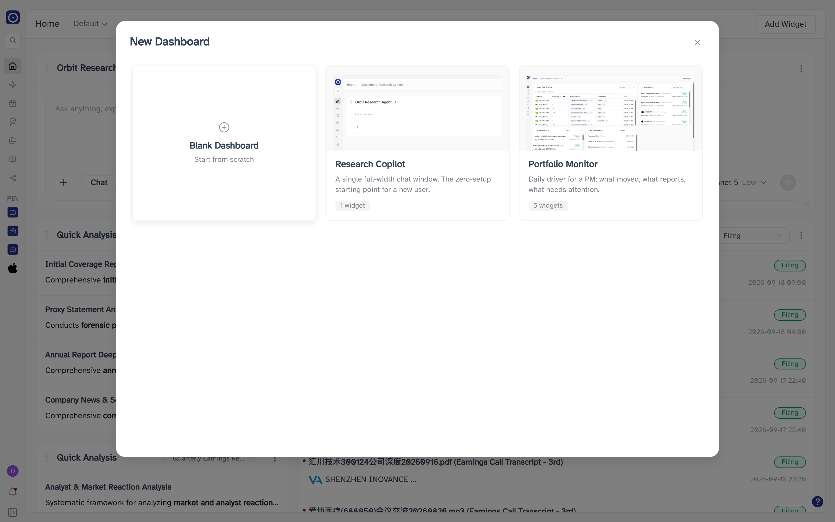
Selecting a card opens a panel on the right with three parts:
| Part of the panel | What it holds |
|---|---|
| Card name and description | Read-only. Describes the layout you picked. |
| WHAT'S INCLUDED | Only on a template — the widgets it will add. |
| SET SCOPE | The two fields you fill in. It is the label above them, not a third box. |
| Name | What to call the new dashboard. Required, 1 to 100 characters, and it cannot be default — that name is reserved. |
| Description | Optional free text, for your own reference. |
A template lists exactly what it will bring, so you can tell the two ready-made layouts apart before committing to one:
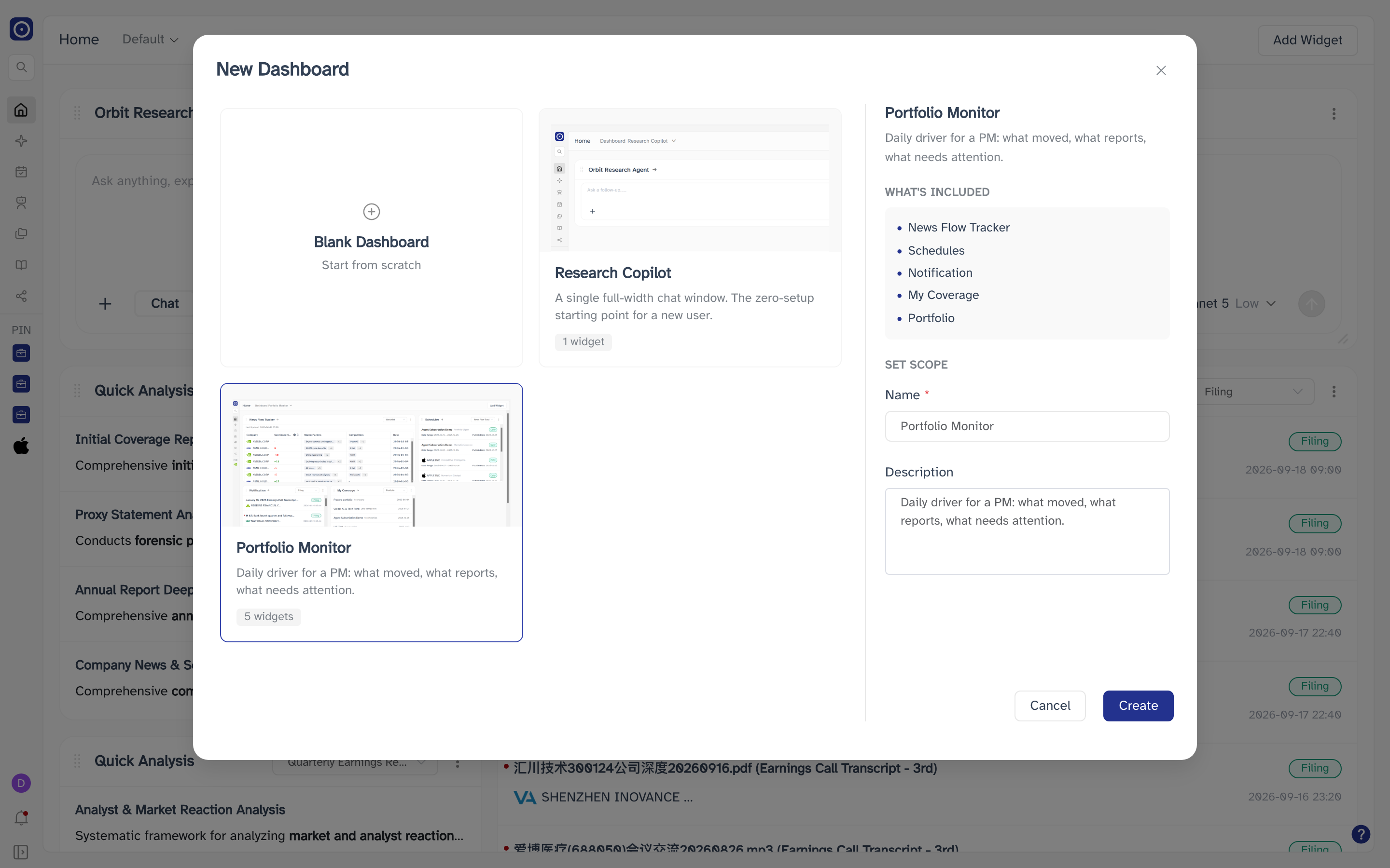
Blank Dashboard has nothing to list, so the panel goes straight to SET SCOPE with both fields empty. That is where you type the name yourself.
Adding a widget
Add Widget at the top right of the page opens the gallery. It is greyed out until you have a dashboard selected, which you always do on a page that has loaded. Creating a blank dashboard opens the gallery for you straight away, since an empty grid has nothing else to do.
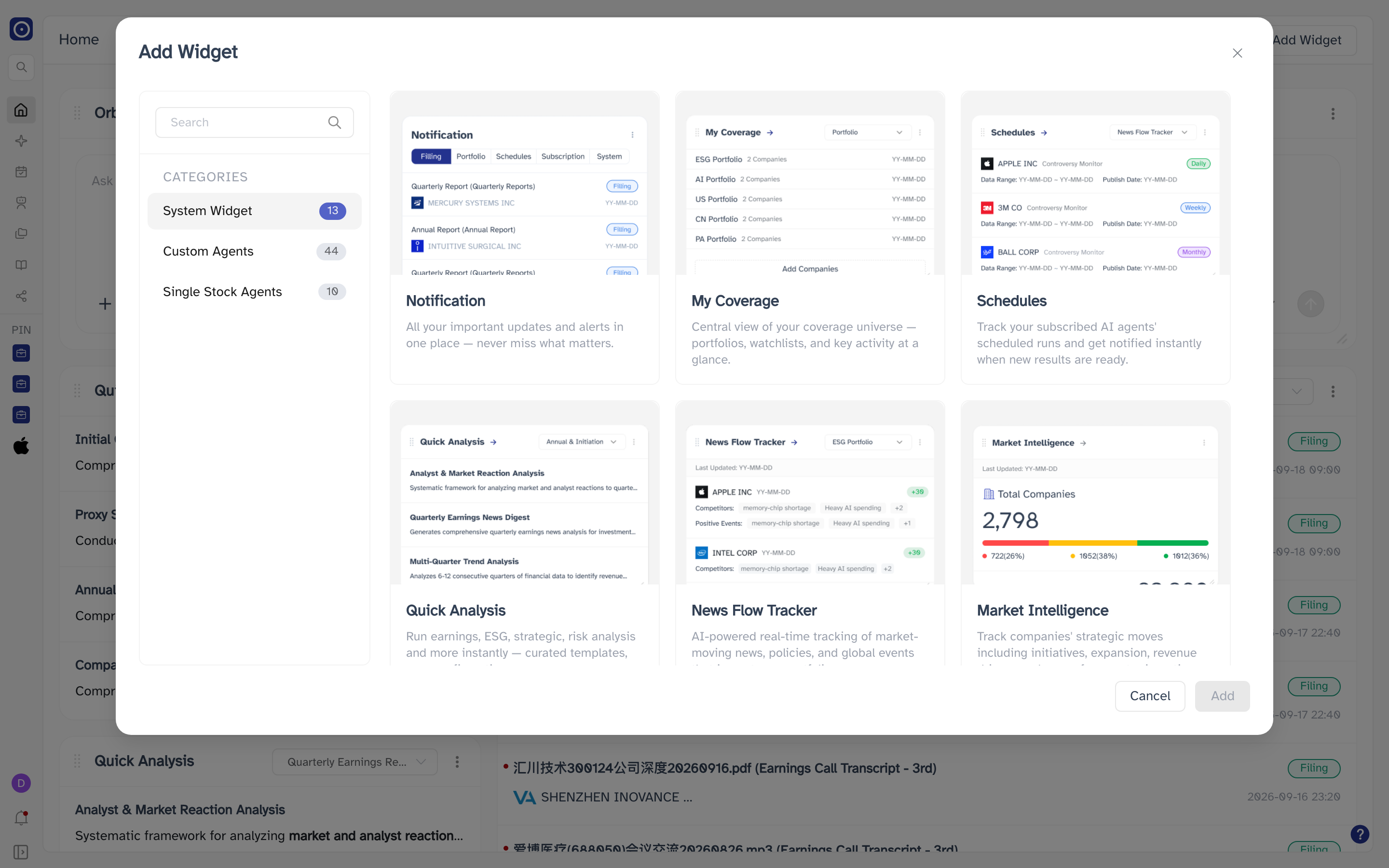
| Category | What it lists |
|---|---|
| System Widget | Widgets built into Orbit. These are the ones you cannot make yourself. |
| Custom Agents | The agents you have built, as widgets. |
| Single Stock Agents | Your per-company agents, as widgets. |
The number beside each category is how many widgets it holds, so a category you have added to since last time will read differently. Search narrows the grid by name; the same search applies across the category you are in, so a category with nothing matching reads No widgets found rather than falling back to everything.
The System Widget category is a fixed set that Orbit builds and you cannot change. The other two categories hold the agents you have built — one card per agent — so they grow and shrink with your own work. All three are described in Dashboard widgets, with pictures of what they look like on the grid.
Arranging and removing widgets
Drag a widget by the handle at the left of its title to move it, and drag its bottom-right corner to resize it. Orbit saves the arrangement as you go, so the dashboard looks the same the next time you open it.
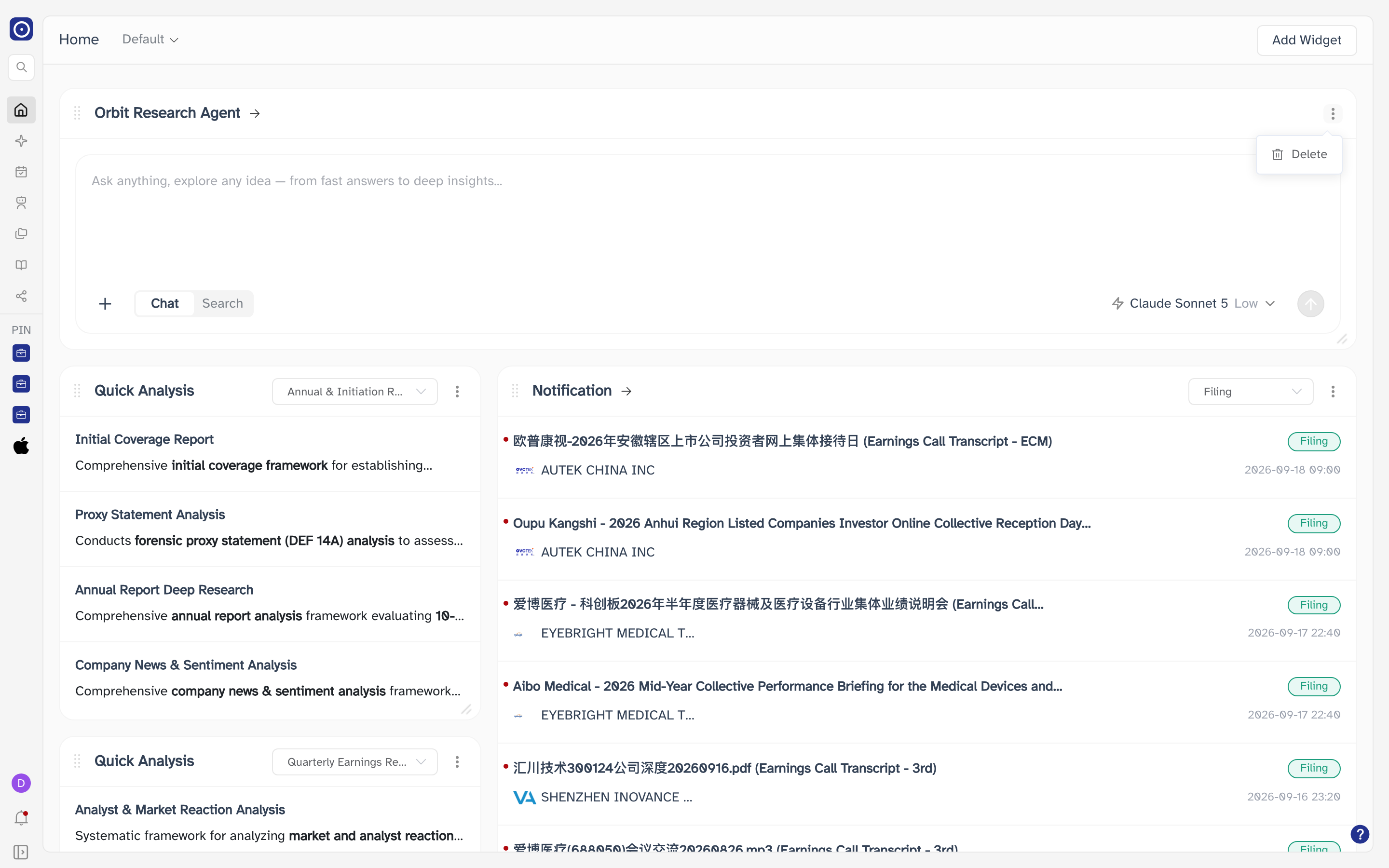
Delete takes the widget off the dashboard the moment you click it. There is no confirmation and no undo — to get it back you have to find it again in Add Widget. A dashboard being deleted, by contrast, does ask first.
What a widget can be
Most widgets are a summary of a page somewhere else in Orbit, sized down to fit the grid. Widgets whose title carries an arrow open that page when you click the title; the rest stay on the dashboard and let you work inside the card.
Two examples that open a full page:
| Widget | Opens |
|---|---|
| Emerging Theme Detector | Theme Discovery — the weekly and monthly theme reports. |
| Earnings Call Transcript | Earnings Call Transcript — the list of processed earnings calls. |
Widgets that do not open anything are still working surfaces: the research agent's card carries a full prompt box, and filter dropdowns on a widget narrow that widget without affecting the rest of the dashboard.
Dashboard widgets is the catalogue: the thirteen system widgets one by one — what each shows, what its title opens, and how much room it asks for when you add it — plus the two categories drawn from your own agents.
What to do next
Start by removing what you do not use and adding what you do. If you are not sure what is available, Create New Dashboard with a template is the fastest way to see a working arrangement — then rename it and make it the default once it suits you.