
News flow detail
One company's news record for one day, as the News Flow Tracker agent wrote it: where the mood sits and which way it is moving, the events and factors behind that, a written summary, and the articles it was drawn from.
Opening the page
- On News Flow Tracker's Detail tab, click the eye icon in the row's Summary column.
- Or open the same panel on the Dashboard and click one of its rows.
- Or click a source card in the Souce panel of News Research.
There is no back control on the page itself; the browser's own back button returns you to the list you came from. The page does return you there by itself if the record cannot be loaded.
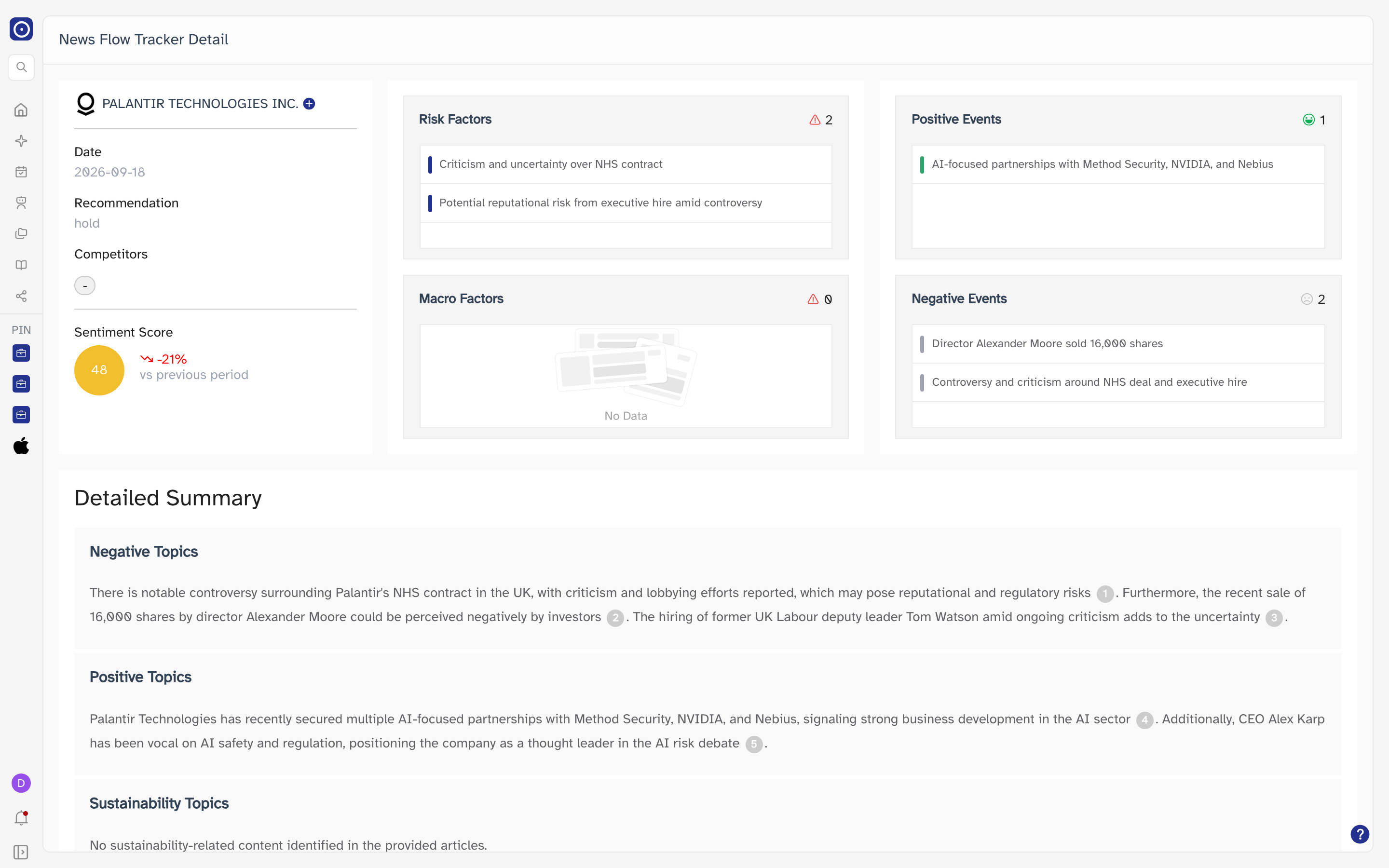
The page at a glance
Three bands, top to bottom: the company card and four factor cards, then a written summary, then the articles behind it. Everything on the page belongs to a single record — one company, one date — so there is nothing here to filter or page through.
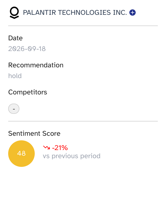
The company card
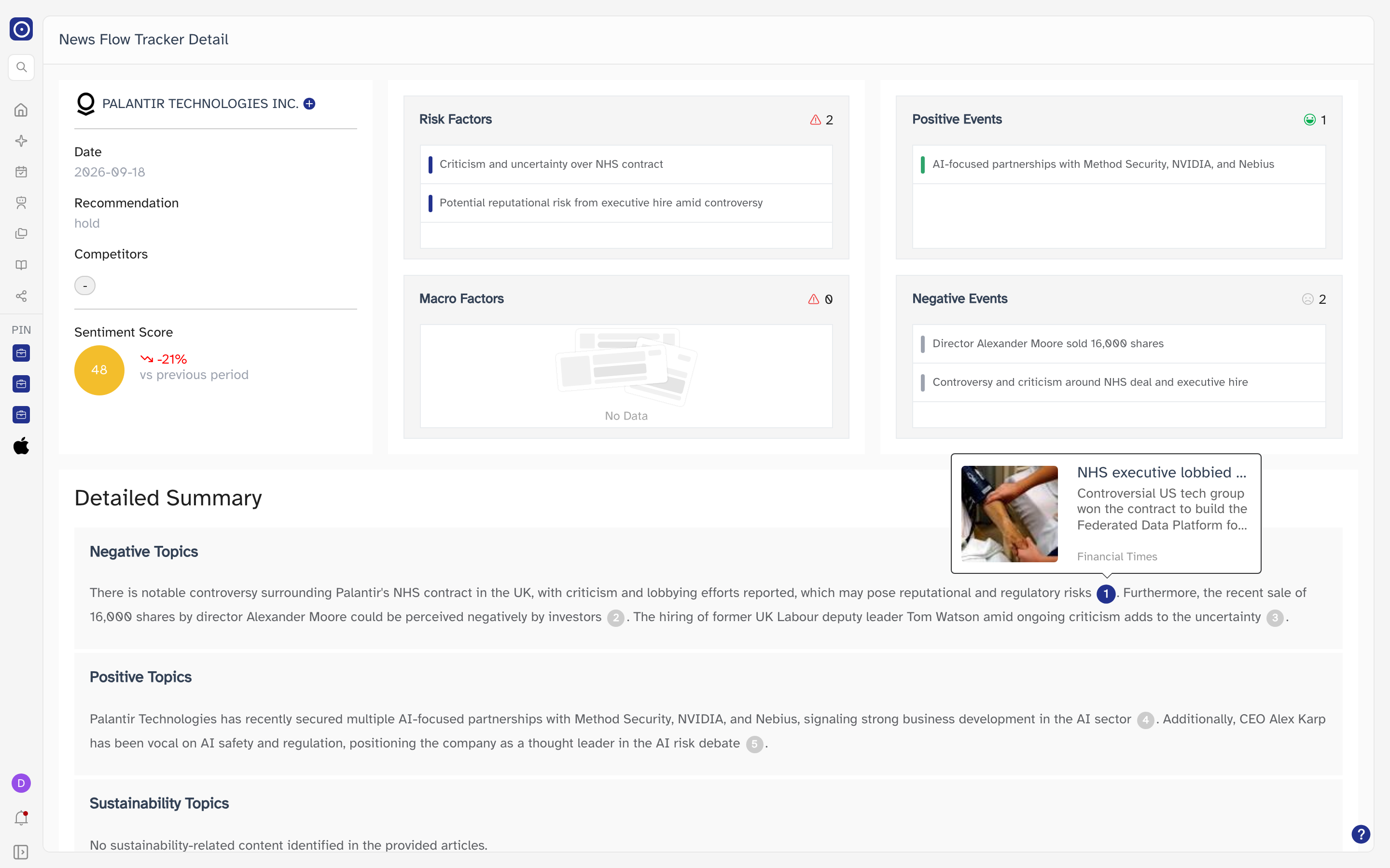
The narrow card at the top left identifies the record.
| Element | What it holds |
|---|---|
| Name and logo | The company, with the logo. The name opens the company's page; the button after the name is the usual two-entry menu — Add to Watchlist and Add to Portfolio. |
| Date | The date this record covers. |
| Recommendation | Orbit's overall call for the company — buy, hold or sell, in lower case. |
| Competitors |
The rivals Orbit matched to this company. Two are named and the rest are behind a
+n that opens on hover; a dash means none were found.
|
| Sentiment Score | The score for this record in a coloured disc, with the change against the previous period underneath it — signed, arrowed, and green for a rise and red for a fall. |
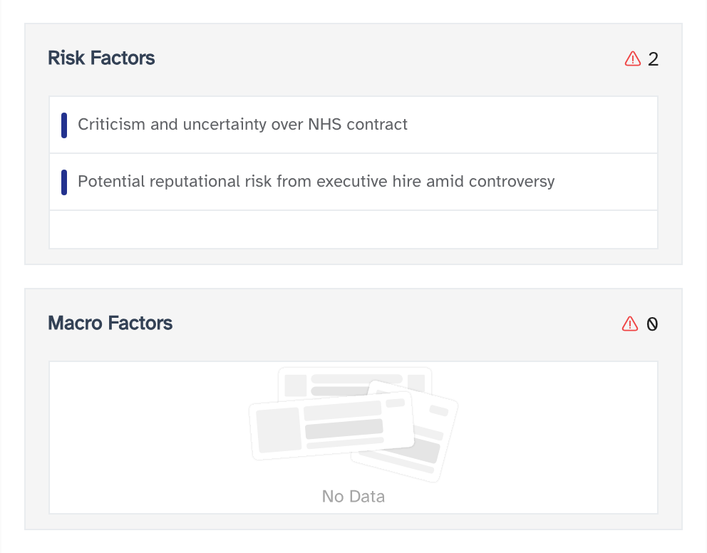
Factors and events
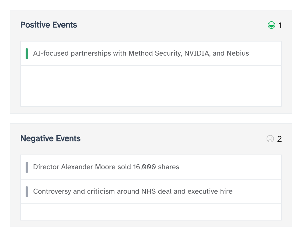
Four cards beside the company card, each a list. Every card shows the same thing — a heading, a count badge, and one entry per line — and each is empty on its own when nothing was found, without affecting the others.
| Card | What it lists |
|---|---|
| Risk Factors | Risks attached to the company. |
| Macro Factors | Wider conditions the coverage tied to it. |
| Positive Events | Events pushing the mood up. |
| Negative Events | Events pulling it down. |
The number in each badge is that card's own line count, so it is a quick way to see which of the four carried the weight for this record. The two factor cards carry a red warning glyph and the two event cards a face — green and smiling for the positive one, grey and downcast for the negative — which is how the grid reads at a glance before you read a word of it.
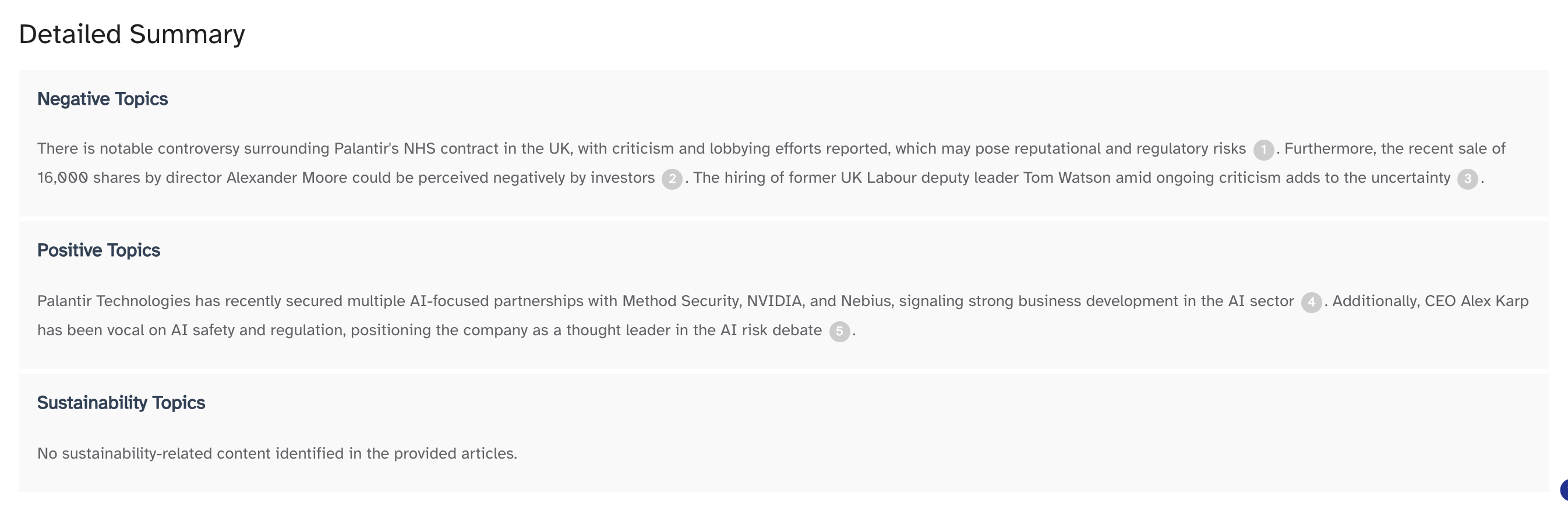
Detailed Summary
The written part, one block per topic — Negative Topics, Positive Topics and Sustainability Topics, in that order, each present whether or not it has anything to say. A block is a paragraph with small numbered circles sitting inside it at the points where a source was used.
Hovering a numbered circle previews the article behind it — thumbnail, headline, three lines of text and the publication. Clicking it opens that article in a new browser tab, which takes you off Orbit entirely.
Sources
A grid of the articles the summary drew on: thumbnail, headline, publication and a line of text each. The headline is a link to the original article and opens in a new browser tab.
The grid is limited to the articles the numbered circles in the summary actually point at, and to those Orbit has a thumbnail for. If none of them could be matched to a full article, the grid falls back to everything the record collected.

When a record is thin
Coverage is uneven, and plenty of records carry no events at all — a quiet day, a small company, or a run that only picked up one article. Each of the four cards then shows its own empty state — the overlapping grey pages and the words No Data — and the rest of the page is unaffected: the summary and the sources are still worth reading.
If Orbit cannot match a summary to its sources, the running text is replaced by three closed sections you open one at a time — Positive Topics, Negative Topics and Sustainability Topics. The words are the same; what is missing is the numbering, and with it the links into the articles.